Instagram is one of the most popular social media platforms in the world. Its distinct logo has played a big role in making it instantly recognizable — the logo reflects not only the app’s evolution in design but also how Instagram’s identity has changed over time. In this blog post, we will explore the history, meaning and evolution of the Instagram logo, why it changed, and what it signifies today.
Origin: The Very First Logo (2010)
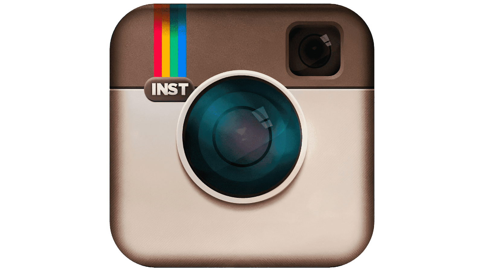
When Instagram launched in 2010, the first logo was designed by one of its founders. (Logotype)
-
This original icon was not abstract at all — it was a detailed camera illustration. It looked like a retro/Polaroid‑style instant camera, complete with lens, viewfinder and a rainbow stripe. (Creative Bloq)
-
The idea was simple: Instagram was primarily a photo‑sharing app, so using a camera icon made sense. This design evoked nostalgia — a sense of old‑school photography, instant photos, and physical prints. (Shopify)
-
The rainbow stripe was more than decoration — it symbolized creativity, fun, and the playful spirit of capturing moments. (Logotype)
At that stage, the logo captured the essence of Instagram’s purpose: instant photos, memories, and the joy of sharing snapshots with friends.
First Redesign (2011): Refining the Vintage Camera
Instagram’s original logo didn’t last long in its first version. Around 2011, the brand worked with designer Cole Rise to produce a refined version. (Creative Bloq)
-
The revised logo was still based on a classic old‑camera style — this time inspired by a 1950s camera design, giving a vintage “Bell & Howell” vibe. (Looka)
-
The update added more realism — better lens detail, lighting effects, a leather-like top part — giving it a tactile, realistic feel. That made the icon visually richer. (Creative Bloq)
-
Despite these tweaks, the core idea remained the same: a camera symbol that instantly communicates “photo sharing.”
Thus, the 2011 logo maintained nostalgia and creativity, while refining the aesthetic for better clarity and brand identity.
Major Redesign: 2016 — From Realistic Camera to Modern Symbol
As Instagram matured and diversified beyond just photos — into videos, stories, messages, and more — its brand identity and design needs changed. In 2016, Instagram underwent a major rebranding — and that included a complete overhaul of its logo. (Creative Bloq)
What changed:
-
The realistic camera illustration was replaced by a flat, minimal camera outline. The detail, textures and skeuomorphic design were dropped. (Shopify)
-
The background became a vibrant gradient — blending colors like pink, orange, purple — moving away from the brown/beige retro palette. (Shopify)
-
All text/logotype from the icon was removed; the symbol alone became the brand marker — making it simpler and cleaner. (SEO Horizon)
Why this change was made:
-
As Instagram evolved from a simple photo‑sharing app to a full-fledged social media platform (with photos, videos, stories, direct messaging, and more), the old detailed camera logo no longer felt representative. (Shopify)
-
The new simplified design is far more versatile — it scales well for small icons (like on mobile apps), adapts across platforms, and matches modern flat‑design trends. (seekvectors.com)
-
The bright gradient and minimal outline conveyed values like creativity, diversity, vibrancy — aligning with Instagram’s growing global and diverse user‑base and content forms. (seekvectors.com)
This 2016 logo became instantly recognizable and remains iconic. For many users, that rainbow‑gradient camera icon is Instagram — more than any word or tagline.
Meaning & Significance of the Current Logo
Why does the current Instagram logo work so well? Here are some insights:
-
Simplicity & Recognition: The minimalist outline + gradient makes the logo immediately identifiable — even at a small size on mobile screens. It cuts down visual complexity.
-
Versatility & Adaptability: Because it’s flat and simple, the logo can be used across a variety of contexts — app icon, web favicon, profile icon, social media shares — without losing clarity.
-
Symbolism of Diversity & Creativity: The gradient colours reflect energy, youthfulness, and a wide spectrum — aligning with Instagram’s user base from all around the world and variety of content (photos, reels, stories, art, memes, etc.).
-
Brand Evolution Reflection: The shift from a fixed, vintage‑camera symbol to a modern, abstract icon mirrors Instagram's transformation — from a photo‑sharing app to a dynamic, multimedia social network.
A semiotic study even suggests that this change strengthened the brand image — giving an impression of spirit, dynamism and positive transformation. (rjoas.com)
Logo Evolution: Quick Timeline
| Year | Logo / Design | Meaning / Why it Changed |
|---|---|---|
| 2010 | Retro Polaroid‑style camera (designed by founders) | Emphasis on instant photography & nostalgia (Shopify) |
| 2011 | Refined vintage camera (Bell & Howell style by Cole Rise) | More polished, realistic, but still retains photo‑app identity (Creative Bloq) |
| 2016 | Flat camera outline + vibrant gradient background | Reflects platform evolution, modern design trends, better scalability (Creative Bloq) |
| Present | Same 2016 icon (with slight updates over time) | Recognizable, flexible, brand‑appropriate across devices & uses (Logotype) |
Why Logo Matters — More Than Just “Looks”
A logo is not just a graphic — it's the face of a brand. For an app like Instagram:
-
Instant Recognition: Users know what the icon stands for, even without reading name. That helps in app stores, in marketing, and among millions of global users.
-
Brand Promise & Identity: The logo communicates what Instagram stands for — creativity, sharing, diversity, community. Logo changes can signal shifts in platform vision.
-
Adaptability for Growth: As Instagram added stories, reels, video, messaging — its identity broadened. A flexible, simple icon helps the brand stay cohesive across features.
-
Emotion & Memory: For early users, the vintage camera evokes nostalgia. For newer users, the gradient icon feels modern and vibrant. Logo taps into emotional connection.
According to design‑theory, when a company rebrands or changes logo, the visual shift can strengthen or damage brand image. For Instagram, the shift in 2016 apparently helped reinforce dynamism, modernity and global relevance. (rjoas.com)
Public Reaction & Criticism
Not everyone welcomed the 2016 redesign. Because the old logo had nostalgic value, many users felt a sense of loss. Some thought the new design was too generic or too similar to other flat‑design app icons. (Creative Bloq)
But over time, as people got used to it — and as Instagram’s use expanded — the new logo became familiar, accepted, and iconic. The fact that Instagram didn’t revert back suggests the rebrand served its objective.
Visual Symbolism: What Instagram Logo Represents (In Simple Terms)
Let’s break down what the current Instagram logo symbolizes — in simple language:
-
🎨 Creativity & Expression — The colorful gradient reflects vibrancy, diversity, and art. Instagram is a place for stories, creativity, expression.
-
📱 Modern & Digital — The flat design matches modern mobile and web‑based interfaces. It shows Instagram is a modern, tech‑savvy platform.
-
🌐 Community & Diversity — The broad spectrum of colors can hint at inclusivity, representing people from all over the world, of different cultures, backgrounds.
-
📸 Connection to Original Roots — The camera outline still connects to the original idea of photography and sharing moments — though in a simplified, modern way.
-
🔄 Evolution & Flexibility — The brand is not stagnant. It evolves. The logo allows Instagram to grow and adapt to new features without losing identity.
Conclusion
The journey of the Instagram logo — from a detailed vintage camera to a simple, modern gradient icon — reflects much more than aesthetic change. It mirrors how Instagram evolved: from a humble photo‑sharing app to a global social media platform with multiple features.
The logo is not just an image — it's a statement: about creativity, community, diversity, modernity, and a brand willing to evolve.
Through its transformations, Instagram managed to carry forward the essence of “sharing moments” while re‑imagining its visual identity to stay relevant in a fast‑moving digital world. The logo’s evolution is a powerful example of how design can shape and reflect a brand’s journey.